
Introduction
Transforming Jira Submissions for Better Outcomes.
CX teams were using an inefficient, error-prone process to raise Jira tickets, resulting in poor issue quality and delays in resolution.
Goals for Streamlining the Ticketing Experience

Improve Internal Tool Usability and Efficiency

Accelerate Resolution Times for Swift Team Collaboration

Guide Users to Submit Accurate and Complete Information
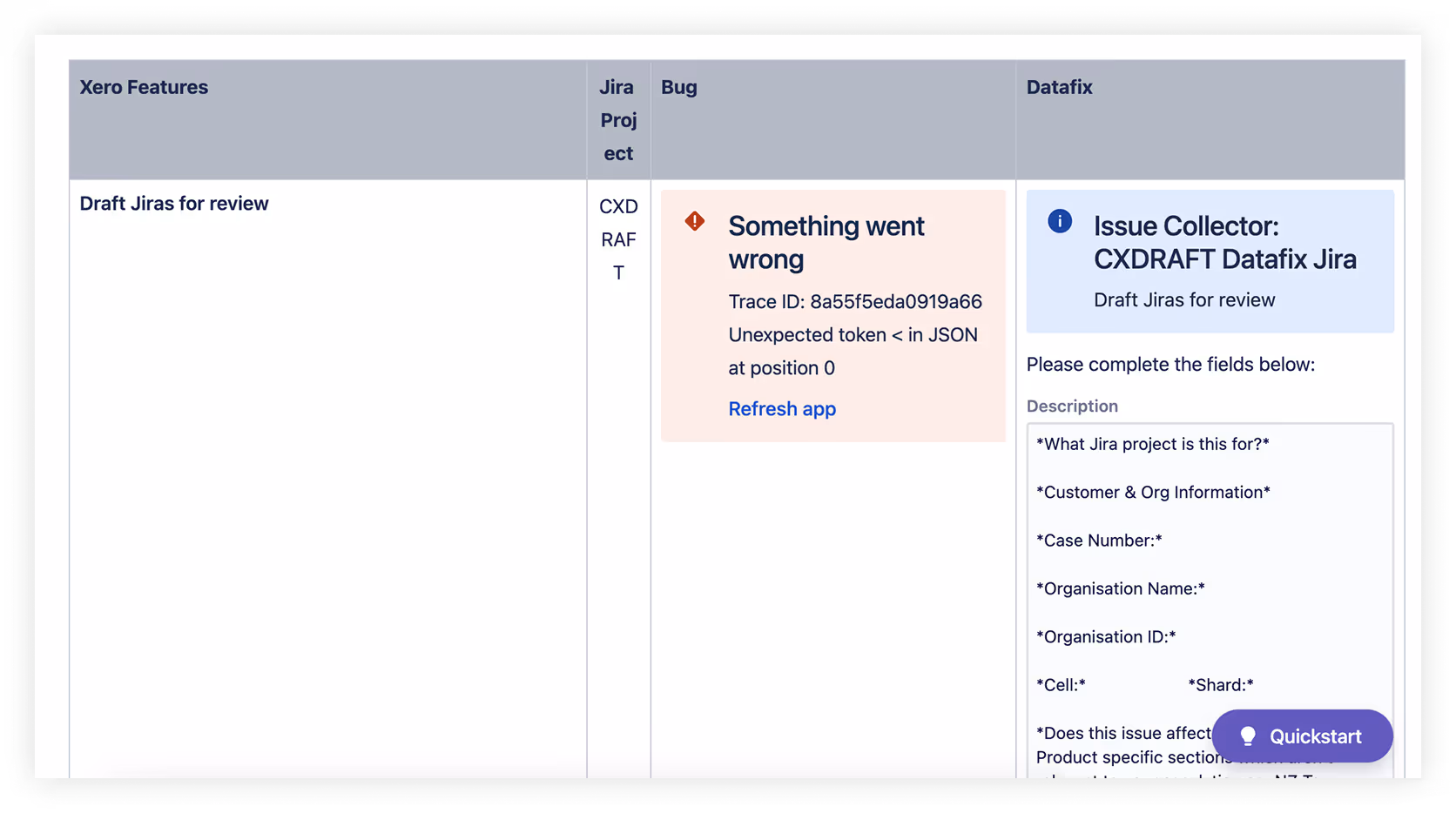
Why the Old Form Failed to Meet User Needs
The original system prioritized structure over usability. Though standardized, the form was cumbersome and confusing—failing to support real user workflows or reduce friction.
Key Issues
Users struggle with unclear instructions and often submit incomplete information.
Impact Summary
These issues lead to delays and frustration for both support and product teams; which pushed back customers issue resolution times.
Process
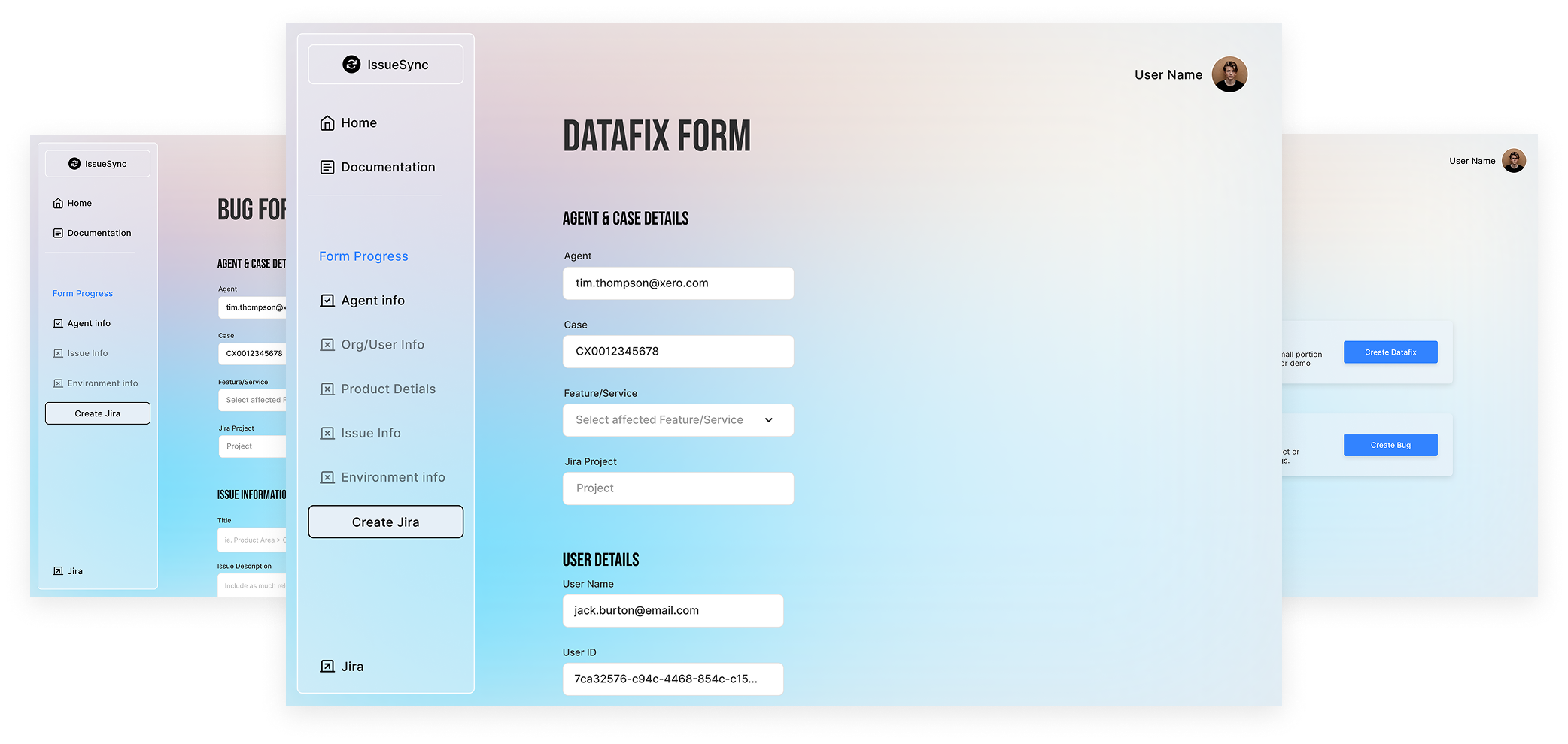
Exploring Form Design Solutions
Low-fidelity wireframes focused on creating a streamlined single-page form with logically grouped fields and clear progress indicators. This approach aimed to minimize user clicks and enhance form completion speed while reducing errors.

Enhancing User Experience Through Thoughtful Color and Accessibility Design
Our design focuses on a calming color palette that minimizes distractions and enhances user concentration. We prioritize accessibility with high contrast and easy-to-read typography to ensure all users can navigate effortlessly.

Calm color palette for improved focus and clarity.

Accessibility ensures usability for all users.

Clear contrast enhances readability and user experience.
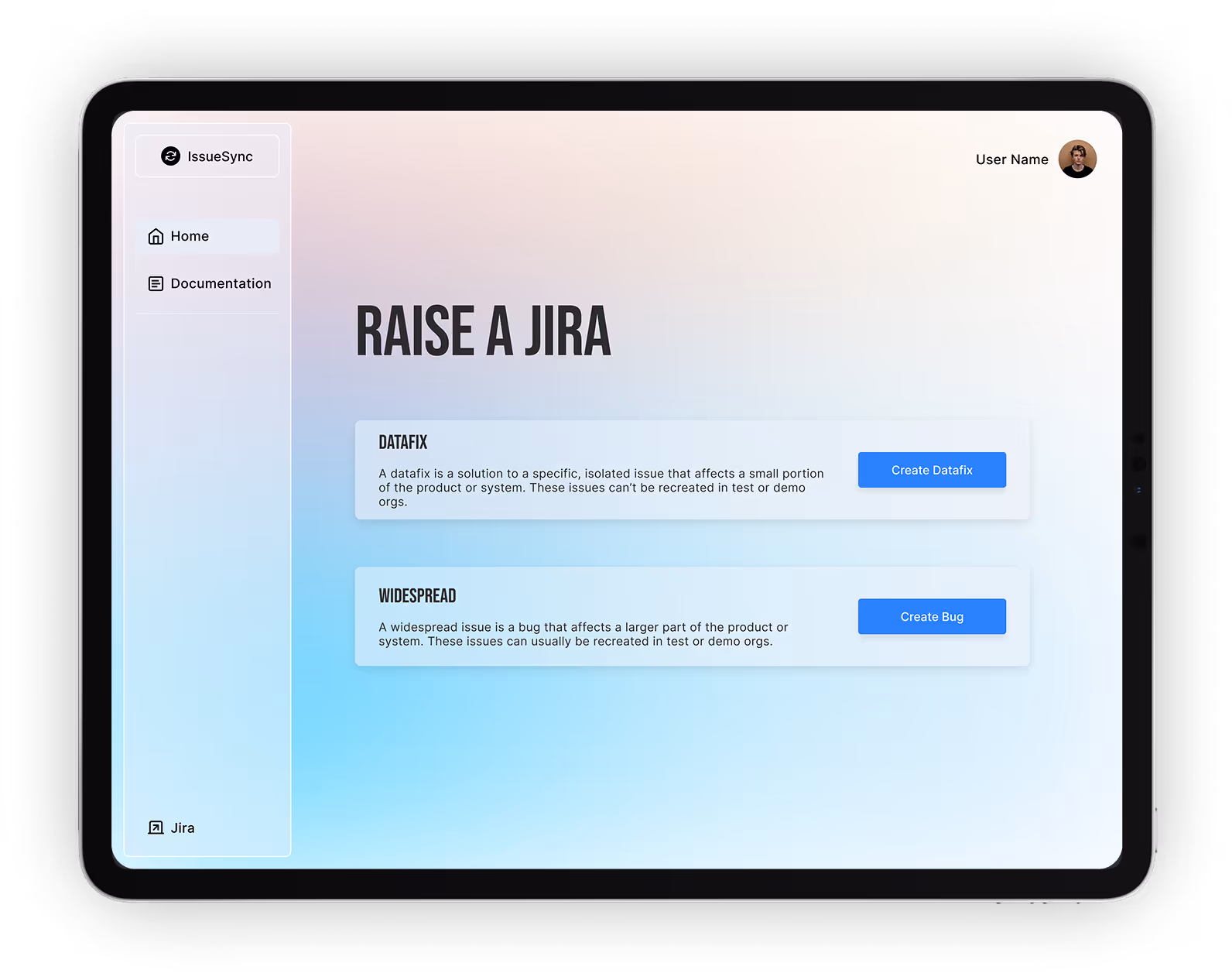
Final Design: A Seamless Experience for Internal Customer Experience Workflows
Our final design emphasizes clarity and responsiveness, ensuring users can navigate effortlessly. With embedded documentation, it supports users in real-time, enhancing their overall experience.
User-Centric Design
A design that prioritizes user needs, enhancing workflow efficiency and satisfaction.
Responsive Interface
Optimized for both desktop and mobile, ensuring accessibility across devices.
Feedback
User Insights and Reactions
User feedback highlighted significant improvements in clarity and speed. Participants expressed increased satisfaction with the new design, noting its usability.
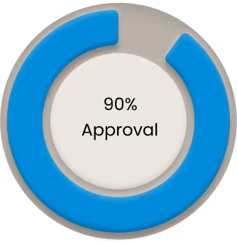
Reshaping User Experience: Key Metrics from Our Redesign Project
Our redesign led to significant improvements in efficiency and user satisfaction. By focusing on user needs, we achieved measurable outcomes that enhanced overall team performance.
Before

After

Conclusion
The Power of User-Centered Design
This redesign showcases the significant benefits of prioritizing user needs in internal tools. By minimizing friction and enhancing clarity, we not only improved the submission process but also fostered better teamwork.
Read the full case study