Introduction
From Snooze to Smooth: Rethinking Xero’s Internal App
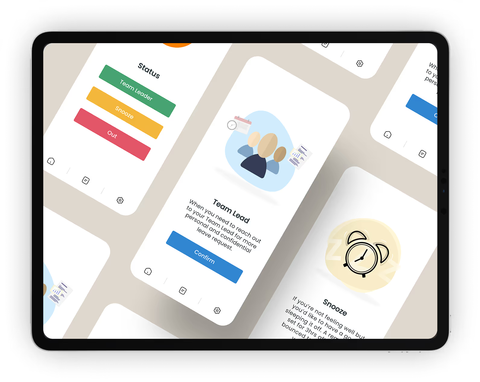
This case study delves into the redesign of Xero Snooze, an internal app that significantly impacts employee wellbeing. By prioritizing clarity and accessibility, we aimed to enhance user experience while aligning with modern brand standards. Discover how thoughtful design can elevate even the simplest tools.


The Challenges of the Original Snooze App
The original Snooze app was loved for its simplicity but fell short as expectations evolved. It became off-brand, inconsistent, and featured hidden functionalities that confused users.
Brand Misalignment
The app no longer reflected Xero’s visual identity and brand standards.
User Confusion
Key features were hidden, leading to frustration and underutilization among users.
A Modern Approach to User Experience
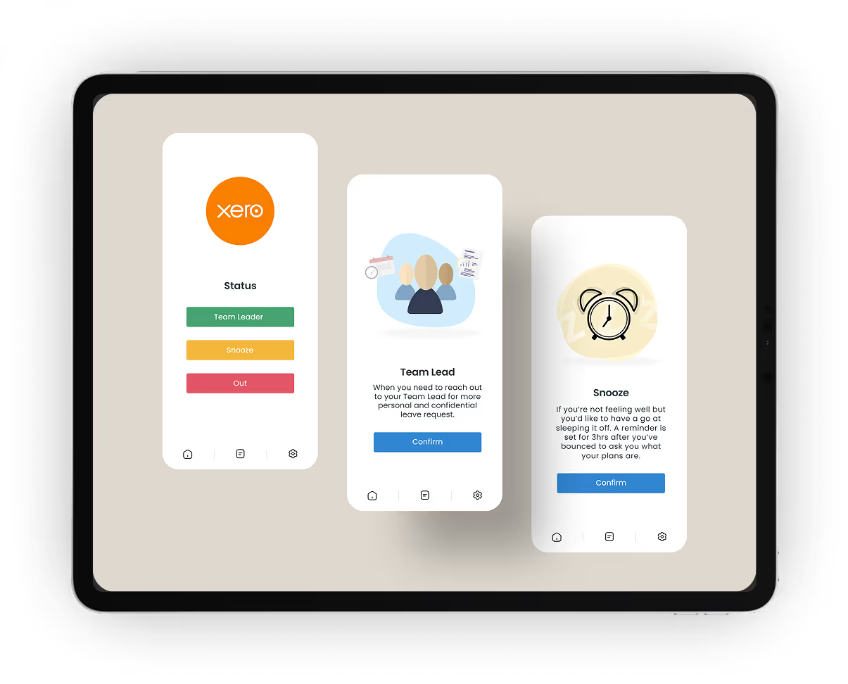
A refreshed interface preserved the simplicity users loved while improving discoverability, accessibility, and aligning functionality with current team needs. By repurposing the "Bounce" feature into a more intuitive "Snooze" function we improved clarity and user engagement.

Process
Research: Understanding User Needs for Effective Solutions
CX leadership and specialists provided valuable insights into the app's usage. Their feedback highlighted the need for a more intuitive and accessible design.
User Feedback
Users expressed frustration with hidden features and unintuitive navigation.
Leadership Insights
Leadership emphasized the importance of clarity, trust and ease of use.
Transforming User Experience for Internal Tools
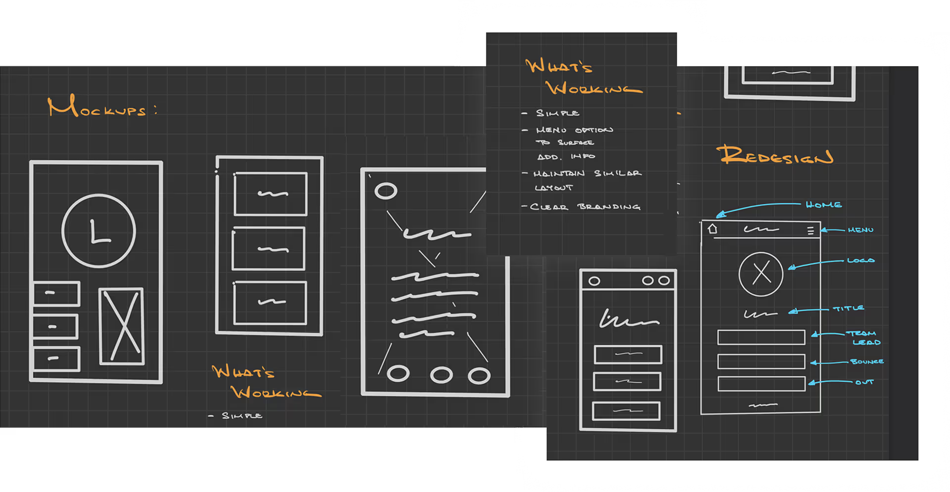
The redesign process explored new layouts, improved navigation, and brand-aligned visuals, keeping the structure familiar to minimize training while enhancing clarity.
Crafting User-Centric Designs for Seamless Experiences
Our ideation process began with gathering insights from users and stakeholders. We aimed to create a design that not only meets functional needs but also enhances user satisfaction.
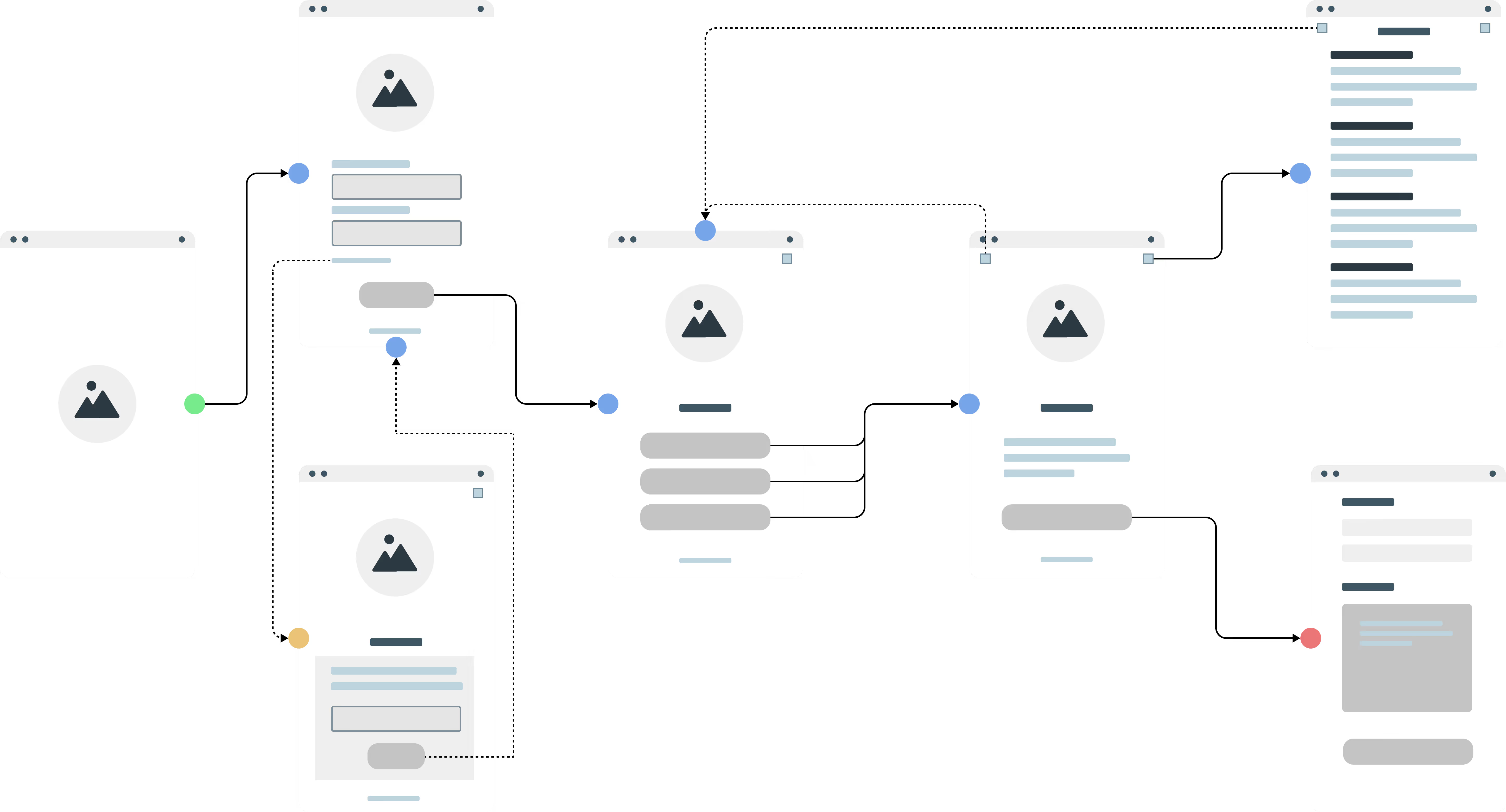
User Flow
A design that prioritizes user needs, enhancing workflow efficiency and satisfaction.

Low Fidelity Mock-ups
Refined user flow ensures intuitive navigation.
Final Design
Transforming User Experience for Internal Tools
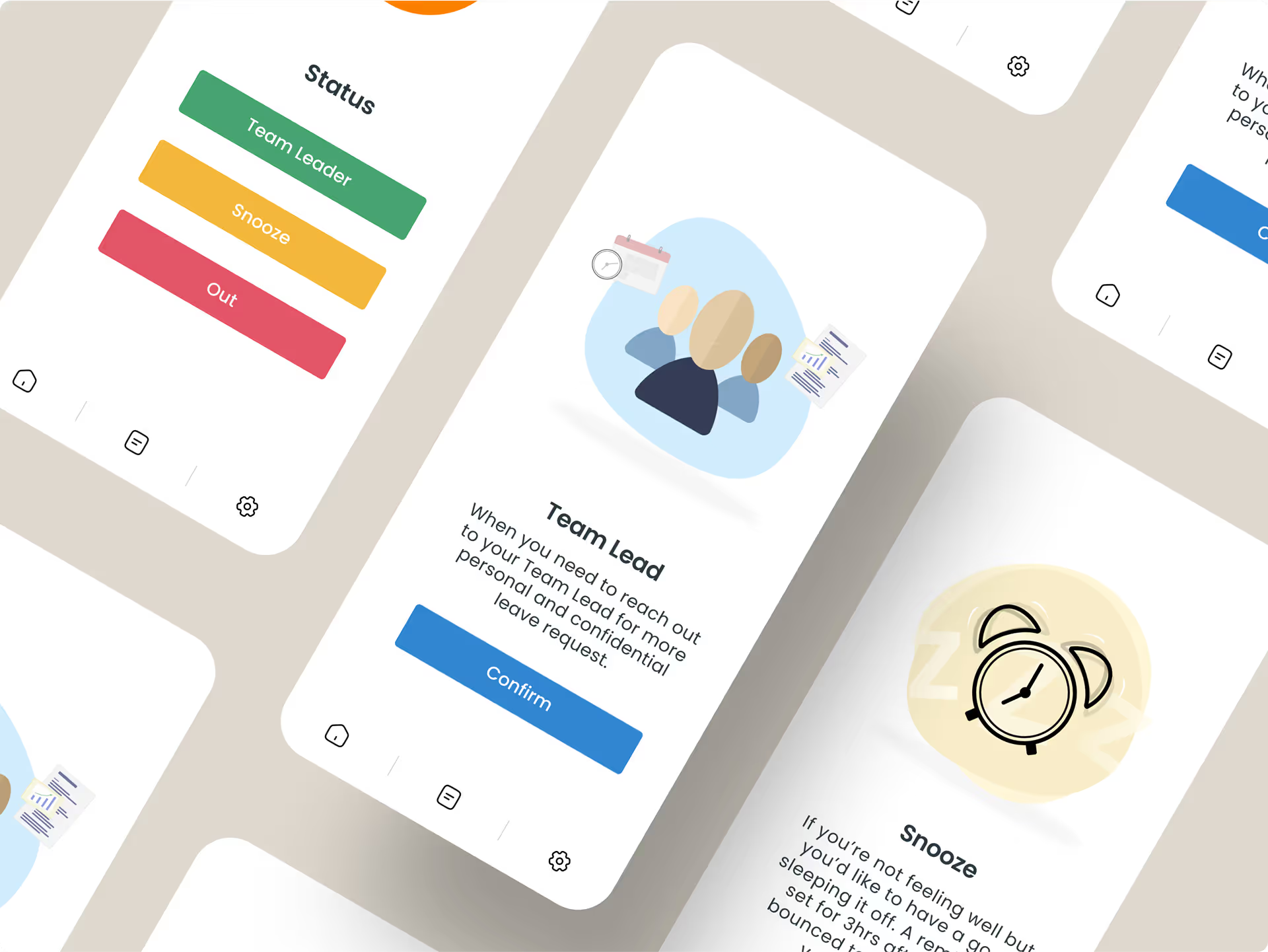
Our final mockups showcase a streamlined navigation experience, enhancing usability. Key features are now more visible, ensuring users can access essential functions effortlessly.
Conclusion
Key Outcomes from the Redesign: Visibility and Efficiency Enhanced
The redesign led to a significant reduction in spam notifications, enhancing user experience. Additionally, core features gained higher visibility, allowing users to navigate the app more effectively.

Read the full case study
