Xero Status

Mobile Application
UI/UX Design
Product Design
Illustration
Overview
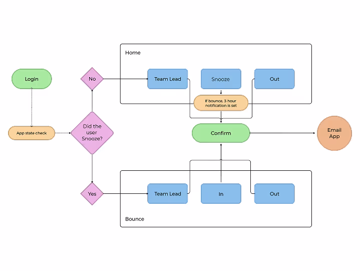
Xero Snooze was an internal mobile app used by the Customer Experience (CX) team at Xero to report absences like being late or sick. The application integrates with back-end tools to automate manual updates for scheduling and ticketing dependencies.
Originally a simple side project, the app was a beloved tool, but as the company grew, its design and functionality became outdated. This case study details the process of redesigning the app to better meet the needs of a growing team while preserving the simplicity that users appreciated.
Originally a simple side project, the app was a beloved tool, but as the company grew, its design and functionality became outdated. This case study details the process of redesigning the app to better meet the needs of a growing team while preserving the simplicity that users appreciated.
~750
Users Impacted
26%
Weekly Engagement
15%
Employee Base
Problem
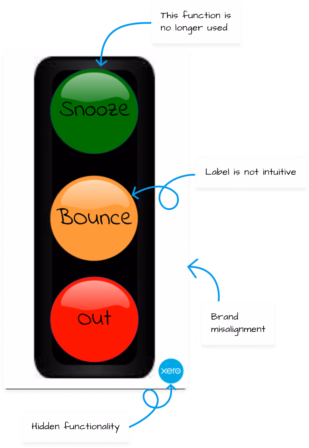
The original Xero Snooze app was visually outdated, not aligned with the company's brand, did not follow common design axioms and functionally underperforming.
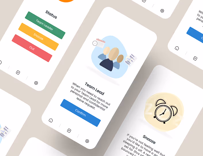
The "Snooze" feature, which notified a manager if a specialist would be 30 minutes late, had become obsolete due to a shift in company policy that made this flexibility standard practice. This led to an excessive number of unnecessary notifications, rendering the feature spammy and redundant .In addition, a valuable function for emailing a manager was hidden behind the Xero logo in the user interface, making it difficult for new users to find despite its increased use. The app also lacked modern accessibility improvements and no longer aligned with internal scheduling expectations
The "Snooze" feature, which notified a manager if a specialist would be 30 minutes late, had become obsolete due to a shift in company policy that made this flexibility standard practice. This led to an excessive number of unnecessary notifications, rendering the feature spammy and redundant .In addition, a valuable function for emailing a manager was hidden behind the Xero logo in the user interface, making it difficult for new users to find despite its increased use. The app also lacked modern accessibility improvements and no longer aligned with internal scheduling expectations
Ideation
The ideation process began with a deep dive into understanding usage, which involved connecting with both the Customer Experience (CX) team members and their leadership. This stakeholder feedback was crucial for identifying key pain points.
Insights from Leadership revealer the "Snooze" feature was either unused or discouraged because it had become spammy. The functionality to email a manager was hidden but had become increasingly valuable.
Insights from Specialists (Direct Users) revealed the app needed a visual overhaul but they appreciated its simple, high-contrast design, especially those with color vision impairments. They also confirmed the "Snooze" function was unused and didn’t make contextual sense. Many were unaware of the "email a manager" function, or discovered it by mistake, despite leaning on it often to quickly connect with their lead.
Solution
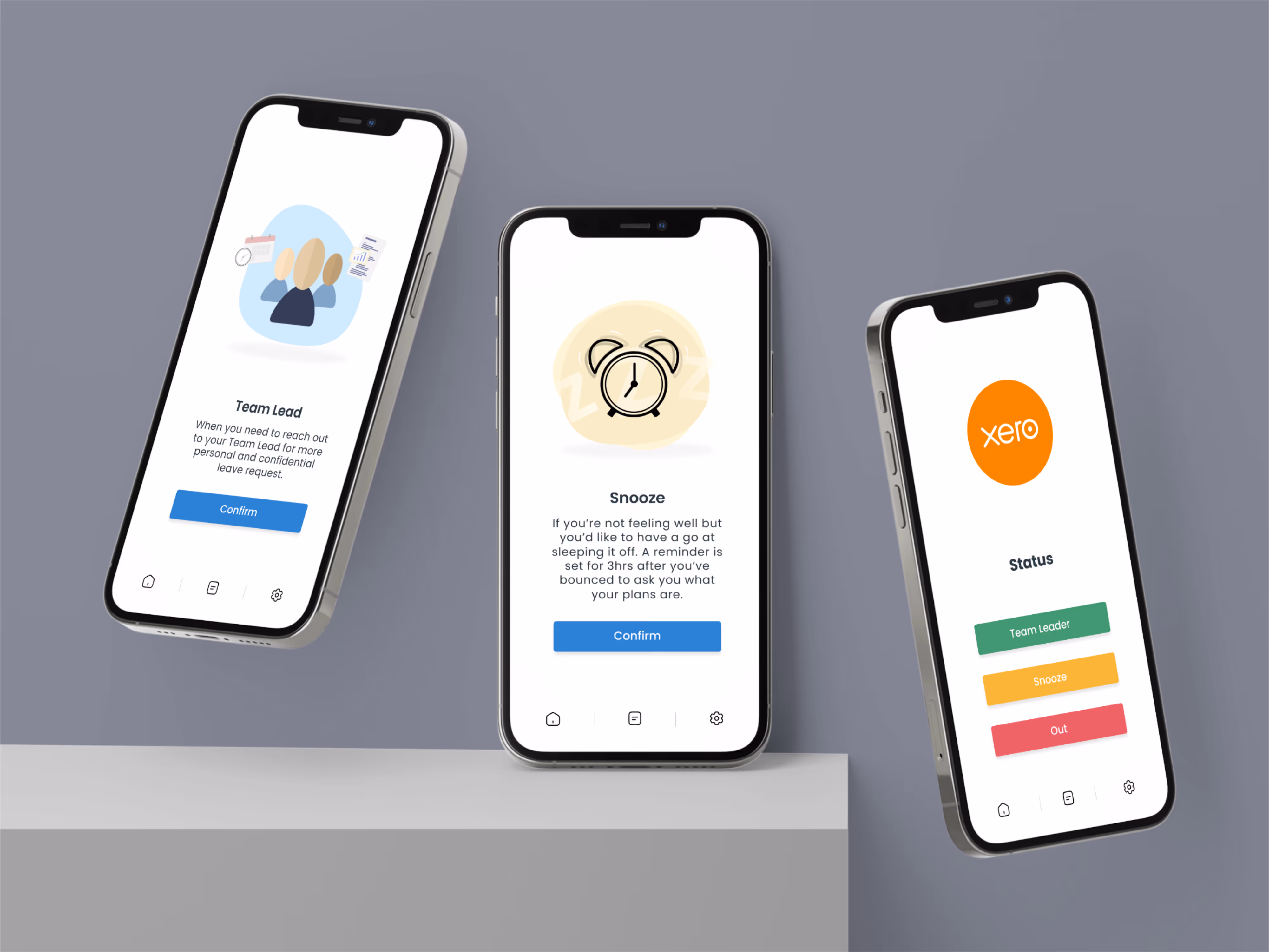
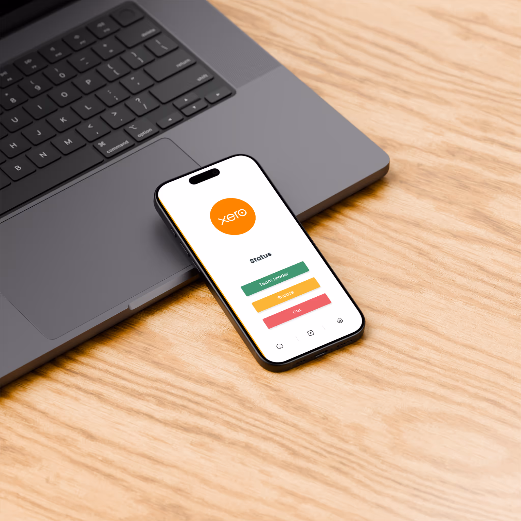
The redesign focused on creating a clean, modern, and brand-aligned interface that addressed the app's core issues without overhauling its simple, high-contrast layout, which users with color-vision impairments appreciated.
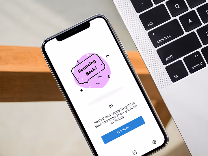
The "Snooze" function was repurposed to replace the "Bounce" functionality; which reduced confusion by providing a more universally understood label for the action. The email a manager function, labeled “Team Leader” was brought to the forefront, making it easily discoverable and accessible.
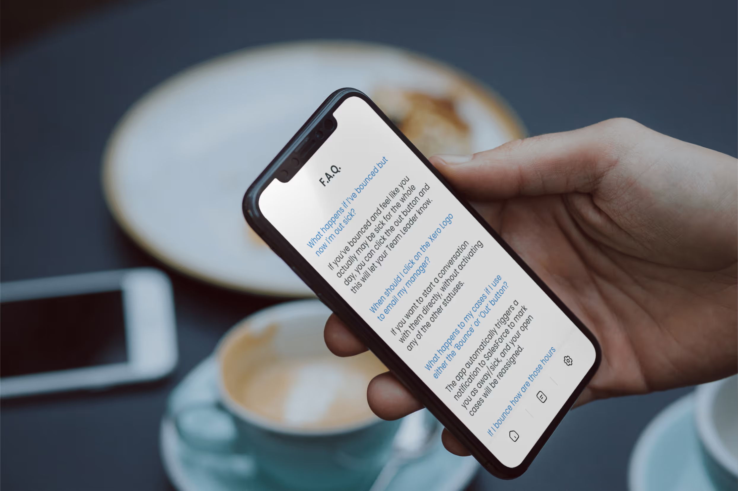
The new design maintained the application's core structure while removing unnecessary elements and incorporating an in-app FAQ section to encourage self-service and reduce the burden on managers.
The "Snooze" function was repurposed to replace the "Bounce" functionality; which reduced confusion by providing a more universally understood label for the action. The email a manager function, labeled “Team Leader” was brought to the forefront, making it easily discoverable and accessible.
The new design maintained the application's core structure while removing unnecessary elements and incorporating an in-app FAQ section to encourage self-service and reduce the burden on managers.
Results
The redesigned app was met with positive feedback from users, who particularly appreciated its accessibility and simplicity. One user noted that it "just feels better to use," while another remarked that it looks "much more professional".
The adoption process was seamless, requiring no additional training due to the familiar layout. The changes also minimized the need for updates to internal documentation.
The success of the redesign highlighted the importance of not over-designing successful elements and the critical role of visibility in user experience. Ultimately, this project reinforced the idea that simplicity and accessibility are often closely intertwined.

