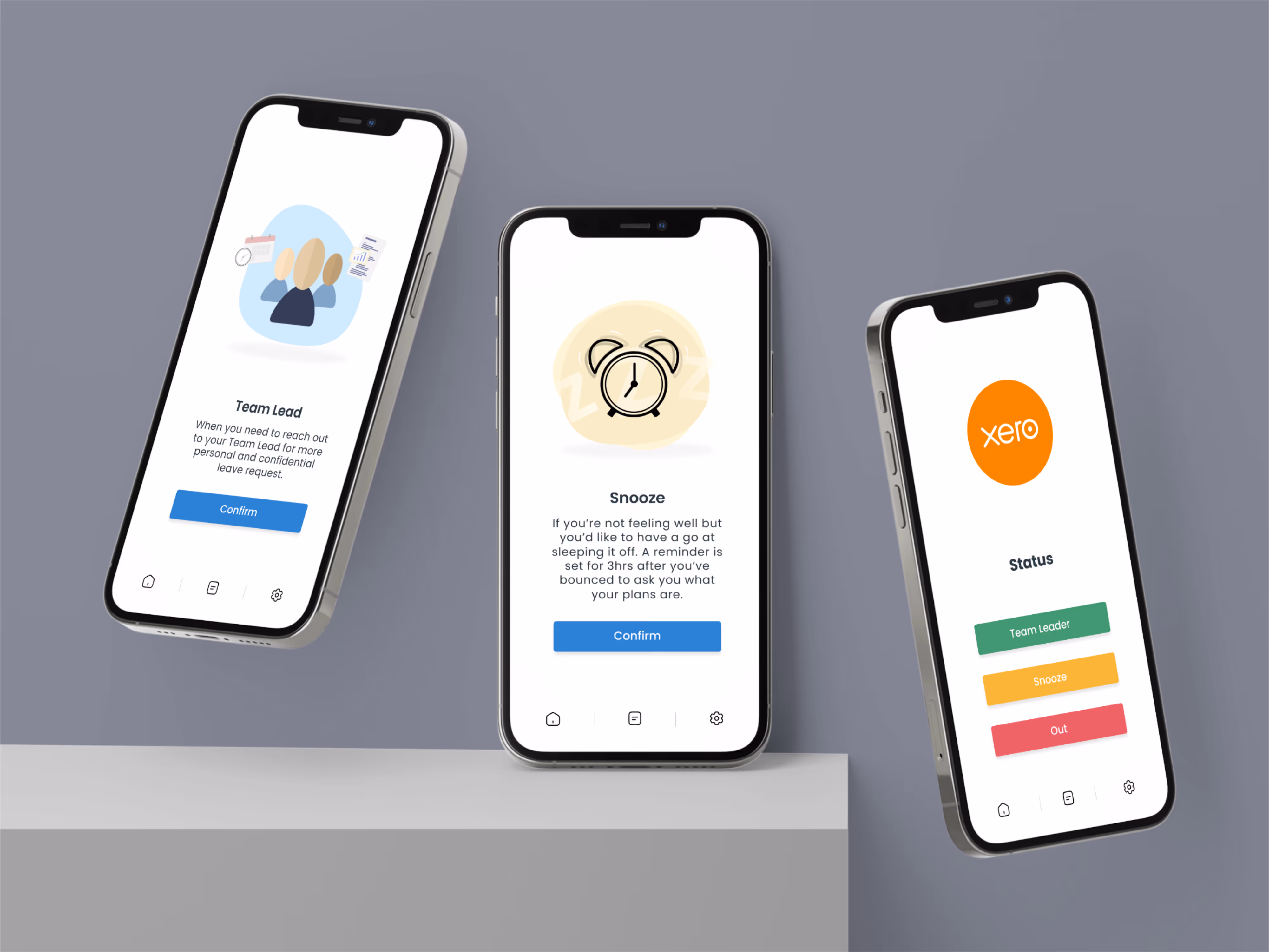
Xero Support

Web Design
UI/UX Design
Product Design
Overview
The core objective of this project was to improve customer service response times by fundamentally reframing how we ask users for information when they raise a support case, all without bloating or overcomplicating the existing submission form.
As the UX Designer, my role centered on conducting discovery, analyzing the current user journey, wireframing new form designs, and prototyping the final guided experience. The project was driven by the principle that every interaction in the support space has a cascading effect, and an initial incomplete submission can dramatically extend a case's life, taking more time away from both the customer and the support agent.
The successful outcome was a redesigned case form that provided clarity and visual guidance, directly targeting a reduction in follow-up touches and improving overall efficiency.
3.7
Million Users Worldwide
~22k
Decrease Tickets/year
18%
Potential for Improvement
Problem
A significant bottleneck existed because when a customer initiated a support case, the submission too frequently lacked specific, essential details required for investigation, which prevented the support team from resolving the issue on the first response.
The hypothesis identified two main reasons for this: customers either simply did not know what information was needed to proceed, or they incorrectly assumed the support system already possessed the relevant details on its end. This deficit of information resulted in an average of 18% of cases requiring the agent to reach back out for clarification, forcing a frustrating back-and-forth cycle. This inefficiency not only slowed down the resolution time for the individual customer but also consumed agent time that could have been dedicated to resolving other user cases, creating a system-wide strain that impacted response times and ultimately negatively affected overall Net Promoter Scores (NPS).
The hypothesis identified two main reasons for this: customers either simply did not know what information was needed to proceed, or they incorrectly assumed the support system already possessed the relevant details on its end. This deficit of information resulted in an average of 18% of cases requiring the agent to reach back out for clarification, forcing a frustrating back-and-forth cycle. This inefficiency not only slowed down the resolution time for the individual customer but also consumed agent time that could have been dedicated to resolving other user cases, creating a system-wide strain that impacted response times and ultimately negatively affected overall Net Promoter Scores (NPS).
Ideation
The ideation phase was launched with the commitment to solve the core problem of missing data through direct guidance. This involved defining two key user personas—the New User (instructional needs) and the Experienced User (bug reporting)—to ensure the content strategy was universally beneficial.
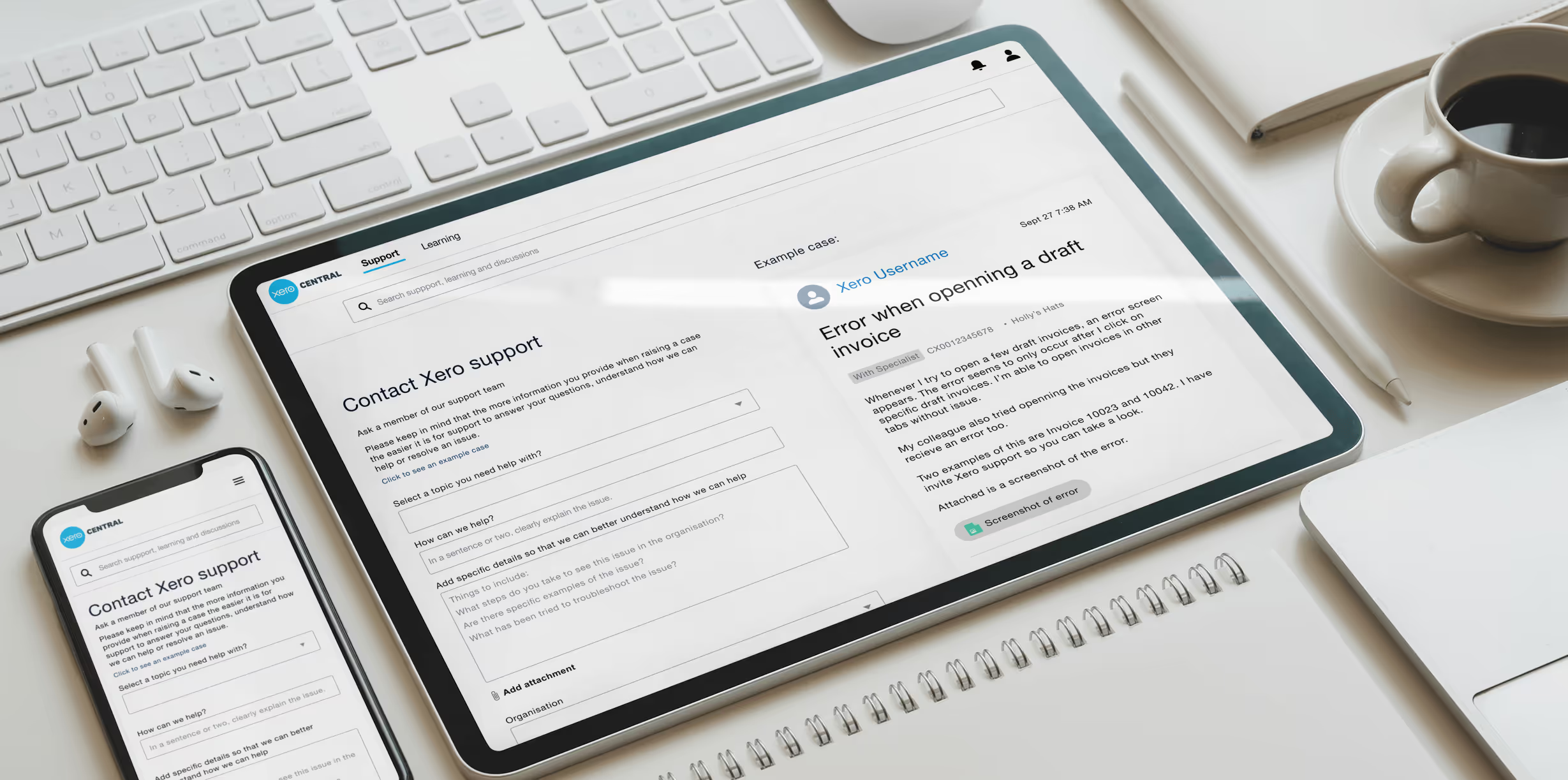
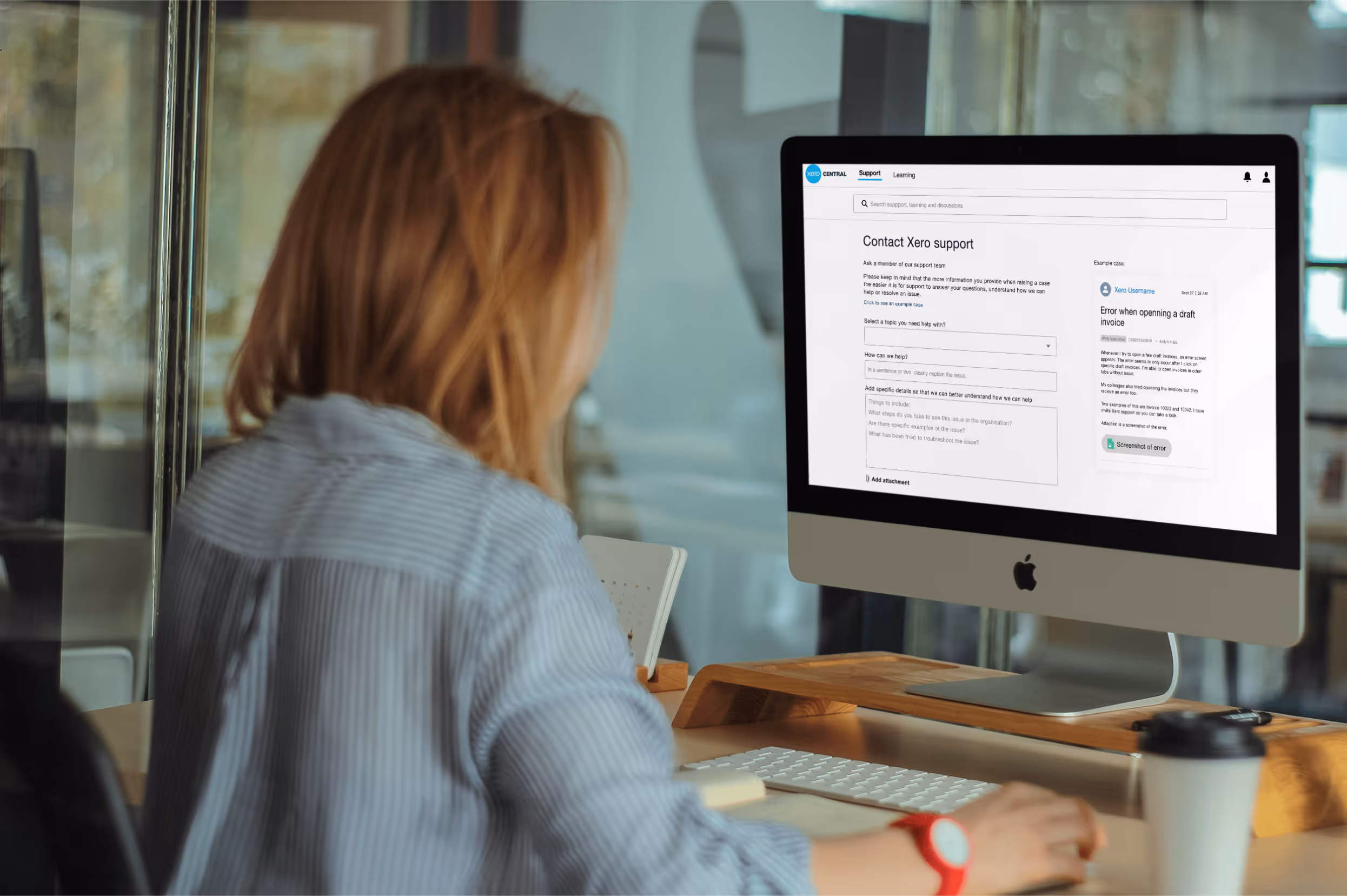
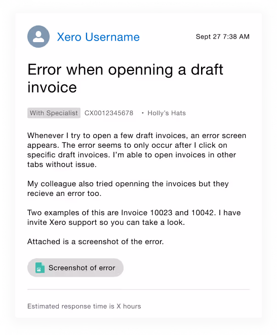
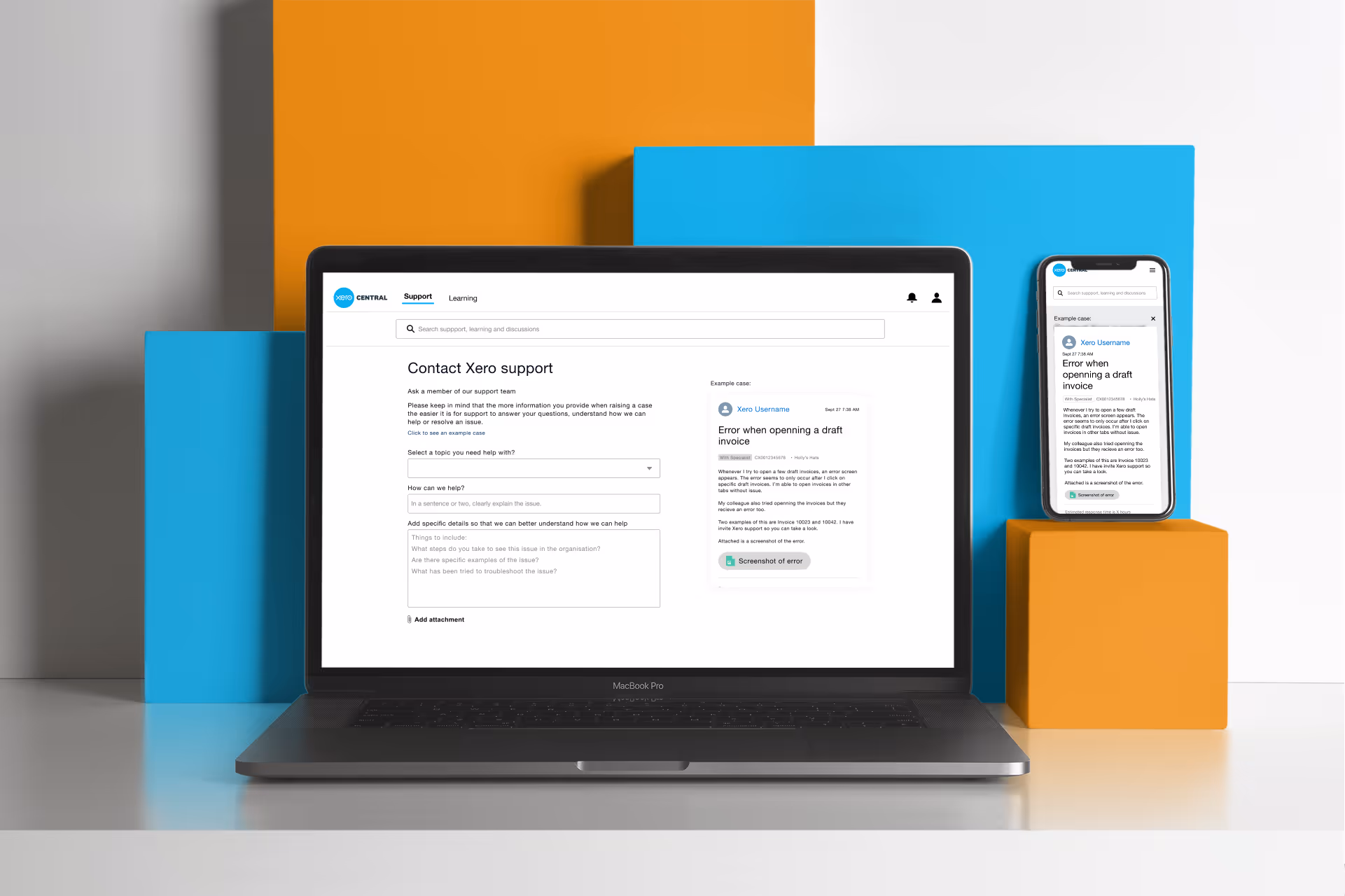
Through rapid brainstorming and wireframing, we analyzed the existing form, confirming issues like disjointed field order and vague wording. The pivotal design decision was to use a visual benchmark (the "example case") to set expectations, directly addressing the user objection that they didn't have time to "write a novel." This choice to provide a visual aid, rather than simply adding more instructional text, drove the subsequent design refinement, which focused on reordering inputs and clarifying language to improve information flow.
Through rapid brainstorming and wireframing, we analyzed the existing form, confirming issues like disjointed field order and vague wording. The pivotal design decision was to use a visual benchmark (the "example case") to set expectations, directly addressing the user objection that they didn't have time to "write a novel." This choice to provide a visual aid, rather than simply adding more instructional text, drove the subsequent design refinement, which focused on reordering inputs and clarifying language to improve information flow.
Solution
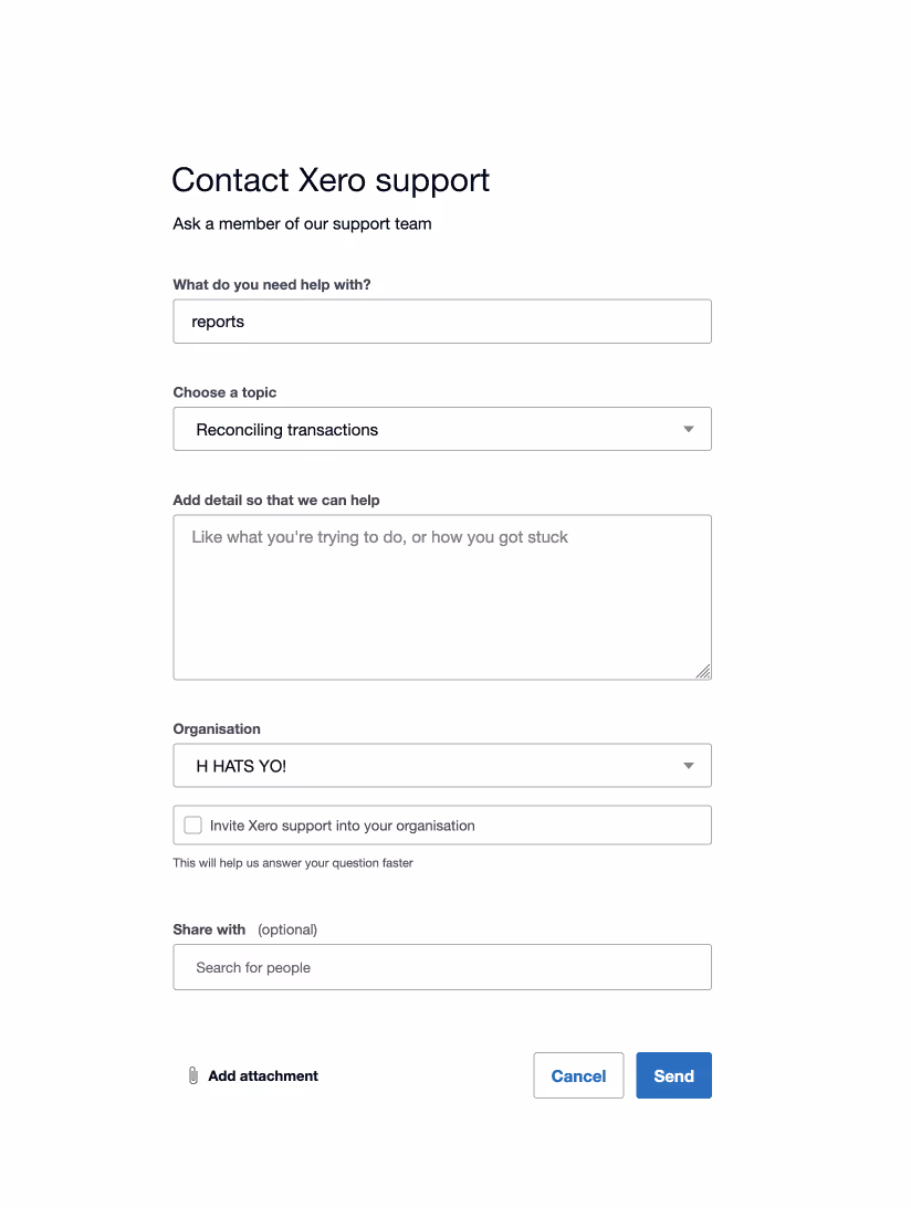
The solution implemented was a comprehensive update to the case raise form, designed to proactively address the core information gap. The redesign focused on making the form more intuitive and instructive through three primary changes.
First, we introduced an introductory statement to the form that set expectations and helped the user understand their role in the resolution process. Second, we added a prominent link to an example case, which provided a visual baseline of what a "good" and detailed submission looks like. This was crucial for overcoming the user objection that writing a "novel" was required, as the example visually demonstrated that detailed information could be concise. Finally, the input fields were strategically reordered and updated with clearer wording to better communicate exactly what information the user needed to provide and mitigate the risk of redundant input.
The design goal was successfully achieved by improving the quality of the initial case raise without demanding excessive time or effort from the user.

Results
The success of the Contact Support redesign is defined by its ability to create a clear pathway toward first-response resolution. While usability testing with real users on the finalized solution is a crucial next step, the expected positive results are clear: we anticipate a significant increase in the percentage of detailed initial raises, enabling support to respond and close cases with their first interaction.
This shift will lead directly to less touches and back-and-forth communication for a single case, resulting in faster response times for all users across the platform. The downstream impact of this efficiency is also projected to reduce process missteps by agents who no longer need to find workarounds for incomplete cases, ultimately bolstering our support model and driving higher NPS scores by demonstrating a respect for our users' time from the very start.
This shift will lead directly to less touches and back-and-forth communication for a single case, resulting in faster response times for all users across the platform. The downstream impact of this efficiency is also projected to reduce process missteps by agents who no longer need to find workarounds for incomplete cases, ultimately bolstering our support model and driving higher NPS scores by demonstrating a respect for our users' time from the very start.